Tuesday, March 15, 2011
Monday, March 14, 2011
Entering the movie Biz
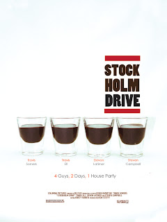
I began with inserting my photo choices into illustrator, then I typed the title, actors, and tagline in the initial layout that I wanted. After I had the layout I went through looking at different fonts and how it interacted with the imagery, how it would stand out, and the mood the font gave for the movie. Above are my initial layouts.
From the Beginning
After looking at my collection of movie poster research I sketched at least 2 rough ideas for each category: Romance, Thriller, and Comedy. The title for all three movie posters is to me the same "Stockholm Drive" was the title for the assignment. Looking off of my sketches I started going through my photography trying to find imagery I could use.
For Romance:
For Thriller:
For Comedy:
Thursday, March 3, 2011
Essence
Above is the final design for my poster of Saul Bass with my final logo in the bottom left corner. I continued with the positive negative type on the black tripes adding more phrases and making the type "cut outs" as if u can see through it, thus having being white in front of the white, and if it's in front of the orange, the font looks orange. I also kept my initial idea of where the bio should live in his face, giving subtle shading and line to his image. I chose his bio font to be cracked.Saul Bass didn't only work with blks and whites with positive and negative shapes, he also used bright vivid colors, thus me choosing orange for a stripe and yellow for the logo.
Representation
After I created the logo for his name I searched through photos/representations of him, looking for one I could use in my poster. I found a design representation of him that looked great. It has irregular positive and negative shapes, perfect to represent the essence of Saul Bass. I live traced it and used it as the main piece for the poster, blowing it up to the full size the poster would be and then I would have the type of the bio live in it. Below are my poster/bio experiments.
Besides his image being positive and negative, I knew I wanted to do something of the sort with the type too. Which is why I initialy put the white "Film Design" on one of the black stripes.
.
Besides his image being positive and negative, I knew I wanted to do something of the sort with the type too. Which is why I initialy put the white "Film Design" on one of the black stripes.
.
Legends
The next project began with us getting a list of well-known and famous graphic designers. The assignment is to pick a person, then create a logo of their name in their design style. Then incorporate that logo in a poster, also designed in their style, with a biography about them and their contribution to the design world. I chose Saul Bass as my graphic designer and to begin I researched his work then made lists of fonts trying to find a few that had his style. Below are a few of those lists.
 |
Subscribe to:
Comments (Atom)


